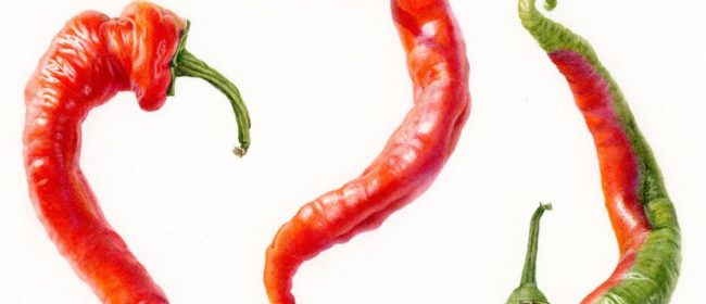
I’ve been wanting to make a series of vegetable paintings with roughly geometric compositions…not the perfect symmetry of say, Ernst Haekel‘s compositions, but something funkier befitting to veggies. The first painting in the series is a round cabbage, so next I wanted something more linear as a contrast. These peppers reminded me of calligraphic strokes…rather wonky calligraphy…so they seemed perfect.

Whenever I want some inspiring vegetables, I head for the local farmers market. 
Last autumn, I found these marvelously delicious and interesting looking Jimmy Nardello peppers. They are heirloom sweet peppers brought to Connecticut from southern Italy by Guiseppe Nardello in 1887. They dry well, and simply sauteed in olive oil they are by far the best tasting peppers I have experienced.


Technical information
In my color studies, I determined that the predominant color in the peppers corresponded to a pigment called Scarlet Lake, a fairly transparent red orange made by Winsor and Newton. This was my mid-range color. To create form, I used a technique that I learned from the master painter, Fiona Strickland. In the areas in the brightest light where I wanted the shape of the pepper to come forward, I used the color wheel to find the next pigments on the warm side of my basic color, which was Winsor Orange Red Shade and then Permanent Orange. To make the form recede in the shady areas, I went around the color wheel into the cooler reds, like Winsor Red, Daniel Smith Anthraquinoid Red and then M Graham Quinacridone Violet in the shadiest areas. I used only single pigment colors and did very little mixing.


 This blog is about my journey as a botanical artist--what I am learning, what inspires me and what I am currently drawing or painting. My desire is to continually hone my skills to better express my wonder and gratitude for the beauty of the creation around me in the Pacific Northwest (USA).
The peppers are fabulous and just jump off the page. I love all the different pure colours you have used instead of mixing. It makes them look so beautifully shiny
Angela, The ‘pure colors’ approach works great for colorful, glossy fruits and flower petals as well. I am glad that you like my painting–thanks for your comment!
Fantastic! Wonderful technique.
Thanks so much, Chris–glad you enjoyed! Best wishes to you.
Beautiful hots — and thanks so much for passing on the technical info!
Thanks, Alina! I hope you find the information useful. Best wishes to you!