Golden Clematis is one of my favorite vines so I was pleased to see that it had so many blossoms during September and October while I was working on this assignment, the fifth in the SBA course I am taking. I spent more time on composition and a tonal study than I did on the actual painting, and I am glad that I did because it is such a complex subject (at least for me as a beginner at botanical painting). The odd angles and twisting stems made it difficult to establish where everything was in relation to everything else.
I wanted to see if I could mix all of the colors from three primary pigments, in hopes that it would unify the overall painting. I spent one whole day just mixing colors, trying to match the actual plant as closely as possible! I started with W&N Transparent Yellow, because that matched the flowers best of all of my yellows. Then I went to the color charts that I made earlier in the course and looked for greens that were close to the leaf color. Fortunately there was one in the Transparent Yellow column that was pretty close. So that led me to use W&N Winsor Blue (Green Shade). Next I decided on Permanent Rose for the red since the burgundy stem color seemed to lean in that direction. So all the colors in the painting are mixed from those three pigments.

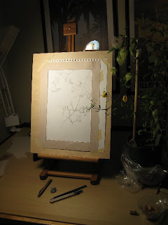
Working on composition–I like to use a frame that approximates the mat opening so I can better envision the finished piece.
I got many compliments from my tutor on this assignment, which was a relief because I had worked so hard on it. She thought it was a complex and challenging subject (how true) and I handled it well. She liked the composition, the many shapes and angles of the leaves, and the accurate way they attached to the stem. She said the flowers were well formed, and the seed head looked suitably fluffy. The shading on the buds could have been improved to give them a more 3D look.
She thought I captured the sulfur yellow of the flowers accurately and shaded them without making them look dull. She noted the limited palette that I used in the leaves, and thought it worked well since I relied on tonal gradation to good effect. She was right about the limited palette. Not only did I use only three pigments in the whole painting, but I mixed my green and for the leaves and just dipped into the same mix for all of the leaves! When I read her comment, it dawned on me that real leaves have many shades of green so I could use color variation as well as tone to describe the shape and light on the leaves. I continued to use a very limited palette through the course, but varied my mixes so the range of shades of green greatly increased in my paintings after this.


 This blog is about my journey as a botanical artist--what I am learning, what inspires me and what I am currently drawing or painting. My desire is to continually hone my skills to better express my wonder and gratitude for the beauty of the creation around me in the Pacific Northwest (USA).
Beautiful!
lovely work,with such a natural composition and just 3 colours is pretty cool too
It’s beautiful, Janene! Thanks again for sharing with me at your house. I really enjoyed seeing your assignments and what you are doing with this. God has blessed you with a great talent! I know you say it takes practice but I believe you have also been blessed!
This is so beautiful and delicate, Janene! I love the composition and color.
Carol
Congratulations Janene, it is a challenging assignment.
Thank you, Alena, Claire, Linda, Carol and Vicki! I appreciate your visit and comments.
I love it Janene, the composition is beautiful and you have done such a wonderful job with the many leaves in all the different positions and how they intertwine. Interesting to read about your approach with the limitted palette of three pigment!s, I think you’ve done wonders with them, I keep being drawn to the seedhead, which is really lovely!
Lovely and so delicate
Sonja, I appreciate your comments very much, especially since I am a big admirer of your work. The seedhead was the most fun of all to do…and the leaves, well not so much!
Thanks Debra!
Stunning Janene
Your work is so beautiful. Wish I could take that course, but I’d need to learn watercolor all over again first ;-).
Hi Janene, just found the lovely work on your blog. The colour of this clematis is just luminous and the seedhead is so much fun!
Sue, Revelle and Sketchbook Squirrel, Thanks for your comments!