Slogging through all of the information and often conflicting recommendations regarding pigments is of the most challenging aspects of learning watercolors. Some artists are convinced that transparent pigments are the only way to achieve bright, clear colors, while to others opaque or semi-opaque pigments are no hindrance at all to beautiful botanical paintings. Some recommend non-staining pigments only, while others say the first layers should be staining with non-staining pigments for final glazes only. And then the debate continues regarding the importance of light fastness in watercolors…especially over the alluringly brilliant but ultimately fading W & N Opera Rose…
I have yet to find two artists who agreed on all of these points or have the same palette of pigments. Which is probably a good thing! In a way, the artist’s palette is part of her unique style. Plus I am forced to banish my lazy streak and actually gain a working, intimate knowledge of my pigments in order to make my own decisions about what my palette will be for each painting and for my general selection of paints. It is helpful to listen to or read about others opinions and the reasons for them, but in the end it is trial and error that answers my questions.
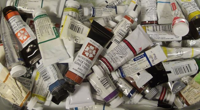
I now have a pretty good feel for what pigments suit me best (more on that later), but have trouble keeping straight all of the detailed information regarding the many different paints. To add to the confusion, different manufacturers use different names for the same pigment (like Winsor Blue Green Shade and Pthalo Blue) or use the same name for a pigment made from an entirely different mix of materials (like Quinacridone Gold). Some paints with the same name may have quite a different hue, or be more opaque or staining than other brands. It is mind boggling…
So I made an index card for each of the pigments that I regularly use. I got some of the basic info from the manufacturers color charts, but often go to the Handprint website for detailed information as well. I make notes of the characteristics I observe as I use my watercolors, like how they perform in washes, what other pigments they combine well with, particularly to create realistic leaf colors or textures. Having the cards to refer back to refreshes my memory (which needs frequent refreshing) when I am working out the palette for a particular painting. It’s a way of getting to know my tools better. How do you sort through all of the different pigment information out there?


 This blog is about my journey as a botanical artist--what I am learning, what inspires me and what I am currently drawing or painting. My desire is to continually hone my skills to better express my wonder and gratitude for the beauty of the creation around me in the Pacific Northwest (USA).
Great post Janene – I love colour theory and learning about pigment qualities – although it is almost a course in itself.
I mostly go by the manufacturer’s recommendations and classifications – and from there if I order a colour I have my own charts which list all those properties alongside the colour sample I record.
In time I find I have my favourites and I know their qualities quite well now.
I agree though when artists talk about colours they use it’s amazing how different all our palettes are and at the end of the day it’s what makes us unique.
I have spent the day sorting through my palettes and trying to find a better way to categorise – that’s what happens when you get too many!
Thanks, Vicki! I make charts too but wanted more room for notes. And yes, having acquired too many pigments is part of my problem!