Grey is one of my favorite colors…I know that sounds odd but after all I am a native of the Pacific Northwest where most of the year its…well…pretty grey. I enjoy the occasional sunny day but sunny weather for too long of a stretch becomes oppressive for me. I begin to yearn for the comfort of a nice grey drizzly day. Once thing I notice here in Portland is that on sunny days, everyone is smiling, people you pass on the sidewalk, people in the grocery store, everyone. The grey days make the sunny ones all the more glorious.

The subtle yet rich tones of grey in the wings and water reflections set off the dramatic white breast and black neck of this Canadian goose defending his mate. Photo courtesy of Steve Acheff
I think a similar thing happens in botanical paintings. The shadows and muted areas are just as important as the bright dramatic focal point. They need each other. I know of an artist who only uses bright pure color in his botanical paintings–the shadows are not muted but rather undiluted versions of the main color of the flower or leaf. His paintings are well executed but hard to live with…sort of like listening to good music that is turned up way too loud…you just can’t stand it for long. His paintings need some comforting greys to rest the eye.
Some would say that grey is not a color but I beg to differ…take for instance the chapter on grey in Jeanne Dobie’s classic book, Making Color Sing. She proves my point. She is a landscape artist not a botanical artist, but her ideas about color mixing and color theory have deeply influenced my approach. One of her first chapters is titled “Mouse Power” about “achieving luminous grays”. Her charts on how the various shades of grey affect the viewers perception of bright colors is…illuminating! The next chapter is on mixing high octane colors but she is careful to remind her readers to “balance jewel-like color with settings of mouse colors”. Yea and amen.

Just look at the range of grey tones in this wing..warm browns to blues and burgundy reds…so lush with color.
When choosing a palette for a painting, one of the most important considerations for me is how do those pigments look when ‘greyed down’? Can I achieve a pure, clean grey with the pigments I have chosen? If my greys look muddy, or splotchy because the paint doesn’t flow well, then I need to rethink my choices. Just to clarify, by grey I mean the low value and intensity of a hue, so much so that it approaches neutral. Often I get my greys by mixing complementary colors or three primary colors. Although nothing beats trial and error, I find a lot of helpful information about pigments here.

Grey tones contrasted with green tones in cabbage painting
Although I feel I have just begun to explore the power of grey, I have found that pigments that are both transparent and “pure color pigments” (as Dobie puts it) are the key to rich, subtle greys. “Pure color pigments” are usually not compounds, and don’t have a lot of additives. Dobie recommends a palette, although it is for landscapes and the colors don’t necessarily translate to botanical painting. Also her book was written over 25 years ago and there are a lot more pigments available now, some that are more permanent than those commonly used previously. She has an updated palette on her website. But her lessons on the interplay of color in a painting still hold true, and are as valuable for a botanical artist as a landscape artist.

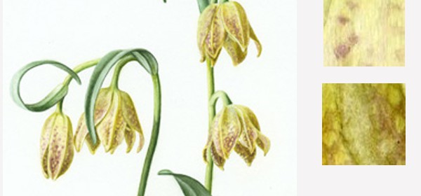
The range of tone from bright to grey expresses the shape of the blossoms

The bark from the Paperbark Maple and autumn leaves from the Oakleaf Hydrangea pop against the fine texture of the bluish green leaves of the Osmanthus in my garden.
For further information about range of tone and specifically ‘greying down’ green, I recommend Dianne Sutherland’s blog post.


 This blog is about my journey as a botanical artist--what I am learning, what inspires me and what I am currently drawing or painting. My desire is to continually hone my skills to better express my wonder and gratitude for the beauty of the creation around me in the Pacific Northwest (USA).
Janene, once again your blog post was fascinating to read and has lots to think about. I recently looked at a poster of several artist’s work and I was struck by how many of the paintings were primarily bright, vivid colors. I had that same desire to want to rest my eyes on something muted after looking at it. I think some of us (myself included) get so enamored by glorious color that we don’t modulate it with contrasting hues. I’m going to to check out your other links on this.
As an aside, I liked looking at how you shaded the yellows in the above sketch. That often seems like such a challenge, but you you have made it both subtle and believable.
Vicky, I am glad that you liked the post. It’s interesting how much soothing green there is in nature, at least here in the PNW, then when you see a flower in the forest, like a Tiger lily, it seems so gloriously bright. I read once in a book on color theory that green is a neutral, so maybe it serves the same function as grey? Shading yellows is tricky but the transparent pure pigments are the key, imo.
A wonderful blog post, and it provides me much ‘food for thought’ about color. Thanks for including the additional links.
Your garden is just as lovely as your art! I often wonder if being an artist inspires one to also be a gardener, or is it the other way around?
Thanks, Debo! Hmmm…the gardener or the artist first…its a chicken or egg problem isn’t it!? My garden does inspire me a lot though.
Wonderful, Janene. I like both the pictures and the commentary. It’s so true about the gray setting off the other colors. My feeling about sunshine is the same as yours. Too much sun and I’m longing for rest for the eyes and soul. Sunshine is loud and so are bright colors unless contrasted with something less colorful. They take on a new richness and subtlety.
Thanks for sharing your beautiful sketches and your comments.
Cris thanks for visiting and commenting. I am not surprised that we are simpatico on this topic!
How interesting. Your stunning paintings and photo illustrate the point so well.
I can’t imagine the drawings without the grey just muted versions of a colour.