I find that more often than not, I learn the most when I am under duress…or at least under pressure of some sort. That happened recently with a commission I got for seven illustrations of wildflowers to be finished in just over 2 weeks, the rough drawings to be submitted in one week. Overall the project was very enjoyable and I felt privileged to get it, but due to the time crunch I worked long hours to get it done on time. During the process the project got expanded to three weeks so that was a big help. I found that the time pressure nudged me out of my comfort zone, and into some new discoveries.
The Project
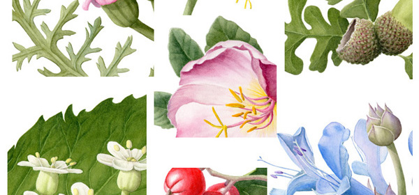
The images are all going onto a one page layout, along with an article, so will be quite small on the page. Some of the wildflowers are quite small themselves, only 1/4″ (7 mm) across, so my challenge was to make a bold enough portrait of them that each image will make an impact on the page. My original paintings are about 10″ x 8″ (25 cm x 20 cm). I reduced the images to the size needed for the layout, which was about 2″ wide by 1.5″ high (5cm x 4cm) each. Once the article is published, I’ll post the full images and a link but here is a snippet of each that I put into a collage so you can get an idea what they look like:
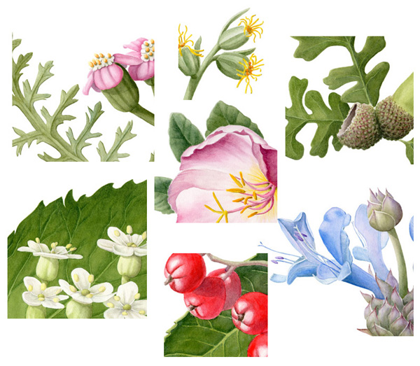
A collage of a section of each painting of seven California wildflowers used for medicinal purposes by native peoples. Clockwise from the top left: Achillia millefolium, Artemesia douglasiana, Quercus lobata, Salvia clevelandii, Heteromeles arbutifolia, Sambucus nigra, and in the center Oenothera californica
Typically when I paint I keep in mind the 10″ and 10′ factor. (I think 30 cm and 3 meters works too!) The 10″ because part of the beauty of botanical art is the fine brushwork and detail. Have you noticed the visitors with their noses 10″ away from the paintings they really like at botanical art exhibits? When I went through the SBA course, it was rumored that some of the tutors examined our paintings with a magnifying glass to check our edges and other detail so I have gotten into the habit of frequently going over my work with a magnifier during the painting process. At some exhibitions, the gallery actually makes a magnifying glass available to visitors so they can really hone in on and enjoy the detail in each piece. But for a painting to be successful, it should have what I call ‘wall presence’ as well–it should have visual impact from across a room, say 10′ or even 20′ away. For this reason while I am painting, I am constantly stepping back to see the piece from a distance to keep the ‘big picture’ or overall impact in mind as well.
Big Brushes
For this project, even though the images would be seen from close range on a magazine page, they would be reduced in size from the originals so much of the detail would be lost. In other words, they would effectively be seen at 10′ range only. I had to focus on the big picture, making sure my colors and shadows were strong, and not so much on the details. My big brushes were the perfect answer to my need to work fast and I thought they would help me focus on big rather than getting bogged down in the small. I laid down big washes on one painting, then got out another while the first one dried, laying washes back and forth. To my surprise I found that I still could control my edges pretty well even with a bigger brush than I was used to using. The precision of the detail seemed more dependent on the quality/length of the tip rather than the size of the brush.
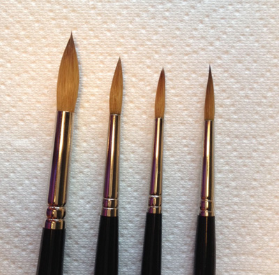
Here’s the lineup of brushes from left to right: #8 W&N; #6 DaVinci; #4 W&N; #4 Raphael extra pointed–just look at that point! Btw, even though all of these brushes are fairly well used, I think the points are still representative.
We botanical artists tend to be small brush people, some more than others. Until recently, I mainly used a #2 Winsor & Newton Series 7 sable brush, until Denise Walser-Kolar introduced to me in her workshop the #4 Raphael 8408 series (extra pointed) brush. With its fantastically long tip, I no longer need my smaller brushes because this one can do it all. Also it holds a lot of paint so I don’t have to reload my brush as often. (Thank you, Denise!) I even use it on vellum. But for this project, I needed to go even bigger than a #4 round. I got out my #8 W&N Series 7 sable and my #6 Da Vinci Maestro sable, both high quality brushes. I found the #8 W&N held a lot of water and was great for laying big washes but it was too fluffy to come to a nice point when full. On the other hand, the #6 Da Vinci was a dream. The tip isn’t quite as long as the Raphael but still could be used for both detail and washes. Part of the difference may be due to brush size, but since the Raphael and the Da Vinci had better points at smaller sizes than the W&N, at least for the way I paint, I am betting the the same will hold true for the larger brush sizes. I just ordered some large Raphael 8408 brushes so I will let you know.
So the time pressure bumped me out of my comfort zone and into the delights of big washes with big brushes….and I got the project done on time! Whew! I can see more wet-in-wet washes in my future. So what size brush do you usually use? Do you have a favorite brand?
Bonus Tip
While using my big brushes, I discovered a wonderful wash for those soft gray/green felted leaves of some desert plants, think Dusty Miller (Senecio cineraria) here. I used it in the Oenothera and the Artemesia illustration.
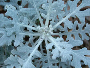
I mixed W&N Cobalt Blue and Daniel Smith Quinacridone Gold, which is a wonderfully flocculating (gotta love that word) mixture. In other words the mixture has a lot of granulation. It tends to dry a lot lighter than it goes on and it looks unattractive on the palette, but when it hits the paper that’s when the fun begins. Besides the beautiful granulation, the pigments tend to separate slightly as they dry so they leave a subtle color variation on the paper. The mixture has to be stirred before each use because it separates on the palette as well. I used Perylene Green for the leaf shadows because the CB+QG mix stays pretty light even with several layers. So if you are an artist who uses washes and likes to paint desert plants, CB+QG may come in handy!
Just a quick note on Quin Gold–I highly recommend Daniel Smith Quin Gold because it is made of one pigment rather than a mixture of pigments to approximate the Quin Gold color. The W&N version works fine on its own, but doesn’t perform as well in mixtures in my experience.


 This blog is about my journey as a botanical artist--what I am learning, what inspires me and what I am currently drawing or painting. My desire is to continually hone my skills to better express my wonder and gratitude for the beauty of the creation around me in the Pacific Northwest (USA).
Absolutely gorgeous work and beautiful colours Janene.
I really enjoyed reading about your commission and the work entailed – especially painting bold because the image is so reduced in the magazine, you want it to stand out.
I agree with your philosophy of close up and wall presence, a fine line to adhere to.
Commissions are difficult when you are driven by size parameters and designers – I am also working on something similar at the moment and it’s difficult to let go of the tendency for botanical detail in exchange for a colourful portrayal. It is so much work to get the scientific accuracy in only for it to be lost in the final sizing.
Look forward to seeing the end result.
Vicki, So interesting that you are working on a similar commission too! I hope you share it if you are able to–I’d love to see what you have been up to. You describe my struggle exactly–letting go of the detail. I wasn’t entirely successful in that part of the endeavor so as a result it took me many more hours than necessary. But the detail is an important part of what I enjoy so it was worth it. Great hearing from you, as always!
As a mature (very!) student – I find this article of yours fascinating and informative.
Thank you for the gray green blend as well – will come in handy.
I love your work!
Thank you, Elizabeth! I am glad that you found it helpful. It’s never too late to start doing something you love!
Wonderful post, packed with helpful insight! I enjoyed learning about your process and thoughts in painting something that needs to be greatly reduced in size. I had always wondered how that is done. Do you have a professional scanner so that you are the one doing the reducing? Or did you submit the original 8×10 versions, and then let the magazine company reduce them professionally?
Hi Debo, Glad you liked the post. I have a good scanner and also have an art scanning specialist that I can go to if needed. In this case, the magazine wanted reduced digital images that they could just pop in to the space so I prepared the scanned images for them with Photoshop.
Janene, the flowers are gorgeous! Beautiful work. Congratulations on this successful project. I would love to see the article with the illustrations, so I hope you will post the link!
Hi Dorota, Good to hear from you! Glad you like my paintings. I’ll post a link to the article in December, after it comes out. Thanks for your interest!
Brilliant blog post, Janene!! Love the tip about 30cm and 3m! And also that colour recipe… I’ll bear it in mind for my desert plants!
Thank you, Shevaun! I hope you find the viewing distances and color recipe useful since I have gleaned so many tips from you!
These are all so nice. I look forward to seeing the full work after publication.
Thanks for your interest, Vicky, I should be able to post them soon, and a link to the article.
Congratulations on the commission and completion. I look forward to seeing the full images.
Thanks, Sue! Good to hear from you.
I have been enjoying your posts about vellum, and then about Heeyoung Kim, the beauty of your art & and writing, & now must thank you for your lovely color recipe and talk about flocculating – I love how that happens with a mixture too= how the two separate and settle out slowly in gradations. & you studied with the wonderful Denise Walser Kolar! Happy, happy you. Now all you have to do is decide to take up egg tempera with the wonderful Koo Schadler & you will be in heaven!
Lea
Thank you for following my blog and taking time to comment, Lea! I went to Koo Schadler’s website and enjoyed seeing her gorgeous work! I’ve long been interested in both egg tempura and silverpoint, so studying with her would be a treat for sure!