In my last post, Simple Steps to Choosing a Palette, I talked about a method I use to determine the pigments for my paintings. In this post, I’ll give you an example of how I go about finding the right mix to match the mid-tone of the leaf color using the primary colors in the plant, then how I expand the spectrum of hues ‘in the same family’ on my palette.
How I Get Started
As I said in my last post, when I decide on a subject for a painting, one of the first things I do besides studying its growth habit and form, is to take note of its overall colors. I then focus specifically on any primary colors in the plant. I use color charts and color cards to match up any primary colors to a pigment. Then I try to use at least one of those primary colors to mix my greens as a way to create harmony in my painting. Now that I have decided on a likely path to follow to get my leaf color, I start mixing. Usually I can match the green of the leaves using at least one of the primaries in the plant in the mix of pigments (a blue, a yellow and a dab of a red), although if it doesn’t work out I just use my chart of green mixes to decide on a green to try.

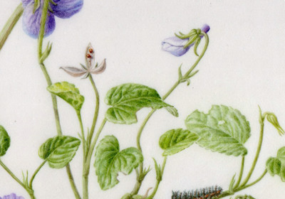
Purple and yellow violets with an orange butterfly, all painted with the same basic pigments, with a few supplemental pigments added in.
Using Primary Colors in the Plant to Mix Green
This painting includes two species of Pacific Northwest native violets, one with yellow flowers and one with violet, an orange and black butterfly and a caterpillar. I wanted to find at least one pigment that I could use to harmonize all of the disparate subjects. Although the two violets were quite different, their leaves seemed to be in the same ‘color family’. The leaves of the violet with yellow flowers (Viola glabella) had a slightly yellower shade of the same green as the purple violet (Viola adunca). I used the yellow that matched the Viola glabella flowers most closely, Hansa Yellow Medium, and mixed it with Winsor Blue Green Shade, then added a dab of the purple that was closest to the other plant’s flowers, Winsor Violet, to tone my green down to an earthier color. So the two flower colors were used in the mix of pigments for the leaves.
Test the Mix
I tested the mix on scrap paper, making small adjustments, until I was pretty sure I had the right shade of green, then tried it on a small scrap of vellum, which is the surface I will be painting on. Since many pigments have a drying shift, I let the mixture dry on the paper/vellum first, then took it outside to check the color match in daylight. I got it just right at last! When I am confident that I have matched the leaf color, I mix up a big enough batch to last through the painting, careful to label the pigments used and which painting it is for in case I have to come back to it later. If I run out of the mid-color before I finish the painting it will be very hard to match it again.

Although I took notes on possible pigments and mixtures to use before I started my first drawings, now I try them out and try to find the mid-green color of the leaves. I was able to use the yellow of one flower and the purple of another flower in the green mix.
Create a Range of Colors
The same plant will have many shades of green, usually the new leaves are brighter and have more yellow and the older leaves may be a richer, darker green. The range of greens can vary quite a bit in just one leaf, so I want to have a range of greens all ready to go on my palette.

I put some of the mid-tone color that I mixed in the middle, with blobs of the pigments I used around it so I can pull the color in the direction I want for different parts of the painting. As I go along, this palette gets messier and more pigments are added for details in the flowers and other elements of the painting.

The palette becomes a myriad of colors as I make progress on the painting.
Unity in Diversity
I used both both Winsor Violet and Winsor Blue Green Shade in both plants and in the butterfly and caterpillar as well to create color harmony in my painting. I found that a combination of Winsor Violet, Winsor Blue Green Shade and Hansa Yellow Medium created a nice deep black for the butterfly and caterpillar. Other pigments I used in small quantities were Cobalt Violet, French Ultramarine, Quinacridone Violet, Daniel Smith Quinacridone Gold, Permanent Orange and Neutral Tint. Much of the orange in the butterfly is made from a mixture of Quinacridone Gold and Quinacridone Violet.
I like to think that my paintings reflect my personal philosophy, even in my choice of pigments and how I mix them…seeing the unity in the created order, and embracing the beautiful diversity as well.


 This blog is about my journey as a botanical artist--what I am learning, what inspires me and what I am currently drawing or painting. My desire is to continually hone my skills to better express my wonder and gratitude for the beauty of the creation around me in the Pacific Northwest (USA).
Thank you for sharing your techniques. I have been interested in botanical art for some time. Just didn’t know a whole lot about technique etc. Your tutorial will be very helpful.
Jan, I am so glad to hear it will be helpful to you–that is what I was hoping! Thanks for your comment.
Well done! I really enjoy art and how you write. Mary
Thanks Mary–glad you enjoyed it! Hope to see you soon.
A great post Janene, so clearly written and with great tips. The painting is beautiful, so delicate
Thank you, Dianne! I am happy that you liked it!!