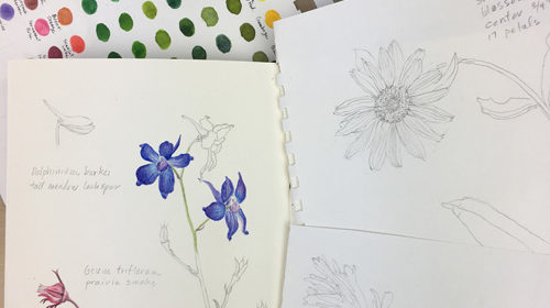
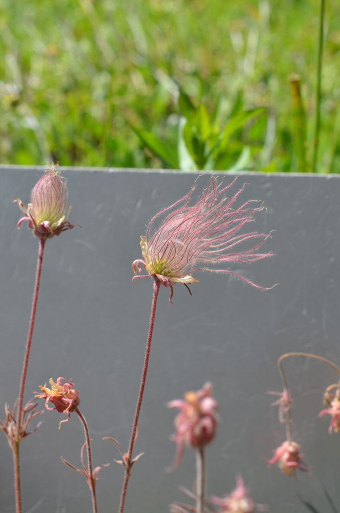
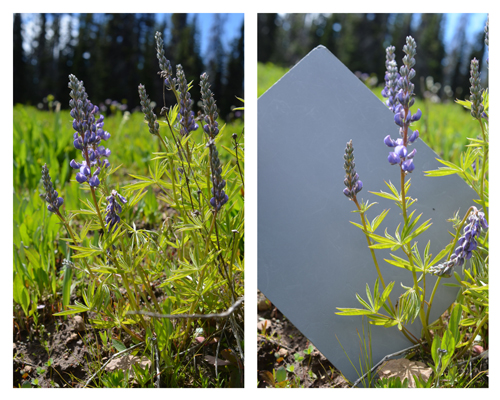
I recently spent a week in what is locally called “the Wallowas”, a pristine mountainous region in the uppermost northeast corner of Oregon far from any population centers, traffic and noise. Because of the high elevation, wildflowers peak in mid-summer when the weather is sunny and mild rather than during our rainy, cold spring here at our lower elevation nearer the coast. The air is clear and crisp, which seems to make colors especially vibrant.
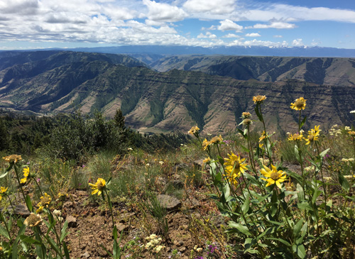
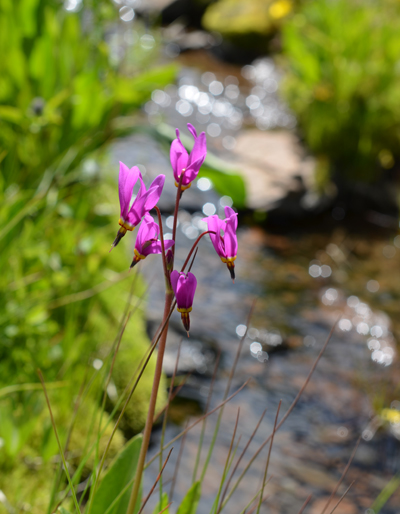
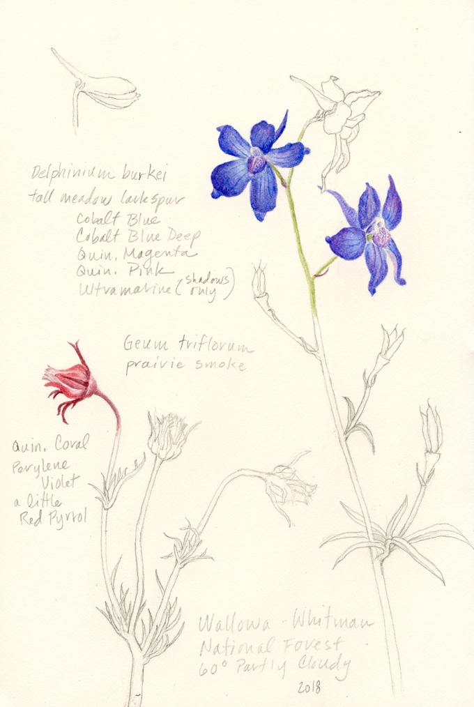
I hope to return to the Wallowas next summer in order to do some more field studies and eventually develop some paintings. It is a magical place.
Please note: If you haven’t already subscribed to my blog posts, I invite you to enter your email address in the box in the right-hand column of this website. The second step is to reply to a confirmation email. My posts consist of updates on my current projects and tips that I have learned along the way. Also, I plan to occasionally offer discounts on prints and cards to my email subscribers only. I never share my list of subscribers, and you can unsubscribe at any time.


 This blog is about my journey as a botanical artist--what I am learning, what inspires me and what I am currently drawing or painting. My desire is to continually hone my skills to better express my wonder and gratitude for the beauty of the creation around me in the Pacific Northwest (USA).
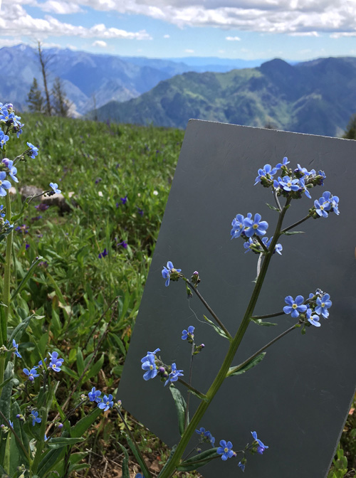
Thanks for sharing these gorgeous photos and sketches! Love the wildforget me nots
The wild forget-me-knots are some of my favorites too–thanks for your kind comment!
It looks a wonderful place. Thank you for the link to the page on the use of a grey card it looks very interesting and I will be going through it carefully. I always struggle when I want to photograph a painting – the white background always ends up looking murky in the corners.
I’ve had the same trouble but have found that using two professional photography natural light lamps help a lot. Dianne Sutherland wrote a great post about lighting for photographing artwork, which gives lots of specific information. I photograph the work I plan to put online but have all of my paintings professionally scanned as well.
Gray card: What a great idea! Thanks for the tip. It’s definitely one of those “why-didn’t-I-think-of-that” kind of things which will be indespensible. Not only for wildflowers and such, but when photographing bumblebees, honey bees and other small docile critters.
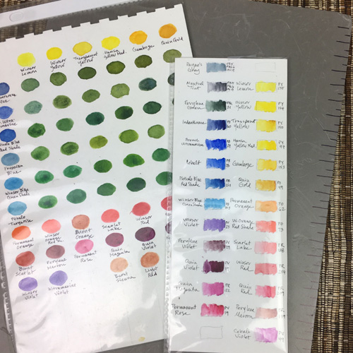
I did a little searching and was able to learn that 18% Gray (the percentage refers to the amount of reflectance) is equal to N5 Gray on the Munsell Scale. This is helpful, because Golden Acrylics makes the entire range of Munsell scale grays so I can paint a piece of cardboard and have at it. (Daniel Smith has the entire Golden line in their factory store if you’re ever up this way.)
Cheers
Hi Steve, Thanks for the tip about the Munsell Scale and Golden Acrylics–I had no idea! I could us that to make a larger ‘card’ for photographing subjects in my studio. Thanks for commenting and sharing the info.
Gray card with centimeter marks! What a great idea! I use gray palette for mixing paints, so it makes total sense. Thank you for sharing!
Yoon, Glad you found the tip useful!